Instant
Instant
Project for McGill University Arts Frosh
A location-based app enabling users to anonymously share moments around the world.
Timeline
June — August 2016


Challenge
In June 2016, our team was assigned the mission of redesigning this app. Despite being available in the Apple store since 2015, it had managed to attract only a small user base.
We loved the original concept but quickly noticed substantial issues that were negatively impacting the user experience and needed our immediate attention:
There was no first-time user experience.
Upon launching the app, users were immediately prompted to share their location with no option to disable it later.
They were then redirected to the map and gallery without any guidance.
Once users had finished exploring the area, nothing was in place to encourage them to return to the app.
The application had accessibility issues.
The navigation, while simple, was not intuitive.
The map was complicated and lacked contrast. The new entries were hard to distinguish from the visited.
The gallery was present twice, and the carousel was limited. There was no indication of the total amount of pictures displayed. Users were systematically redirected to the first uploaded picture.
The app needed more love.
The native map and camera interfaces gave the app a generic look.
Video recording was not supported, and the image aspect ratio was altered.
The draw tool was the only way to customize pictures.
No information was attached to the pictures.
The actions were unclear.
The style was inconsistent and outdated.
The initial name, "Lily," did not reflect the app's intended purpose.
The app was only available for iOS devices.
Mission
I worked in close collaboration with a project manager and a full-stack developer to revamp the application and expand its reach to a wider audience.
Our primary goal was to provide a more accessible and enjoyable experience for users. It was essential that they felt in control of their anonymity so that they could focus on their journey of self-expression. 📸 🎨
One of our major challenges was preserving the original concept's simplicity while integrating new features.

New identity
With the concept of leaving memories behind while progressing, I drew inspiration from instant film, a concept popularized by Polaroid. Therefore, we decided to rename the app as "Instant."
I transitioned away from the app's original neon color scheme and opted for a monochrome palette complemented by a gradient — symbolizing the color spectrum of light. It was an exciting opportunity for us to experiment with holographic materials for giveaways. 👀


The initial logo was a tribute to the stray cats that roam the streets of Montreal.
I kept this concept because cats are known for their secretive yet approachable nature.


I picked the Gotham typeface because of its distinct and rounded characteristics and wide range of widths.
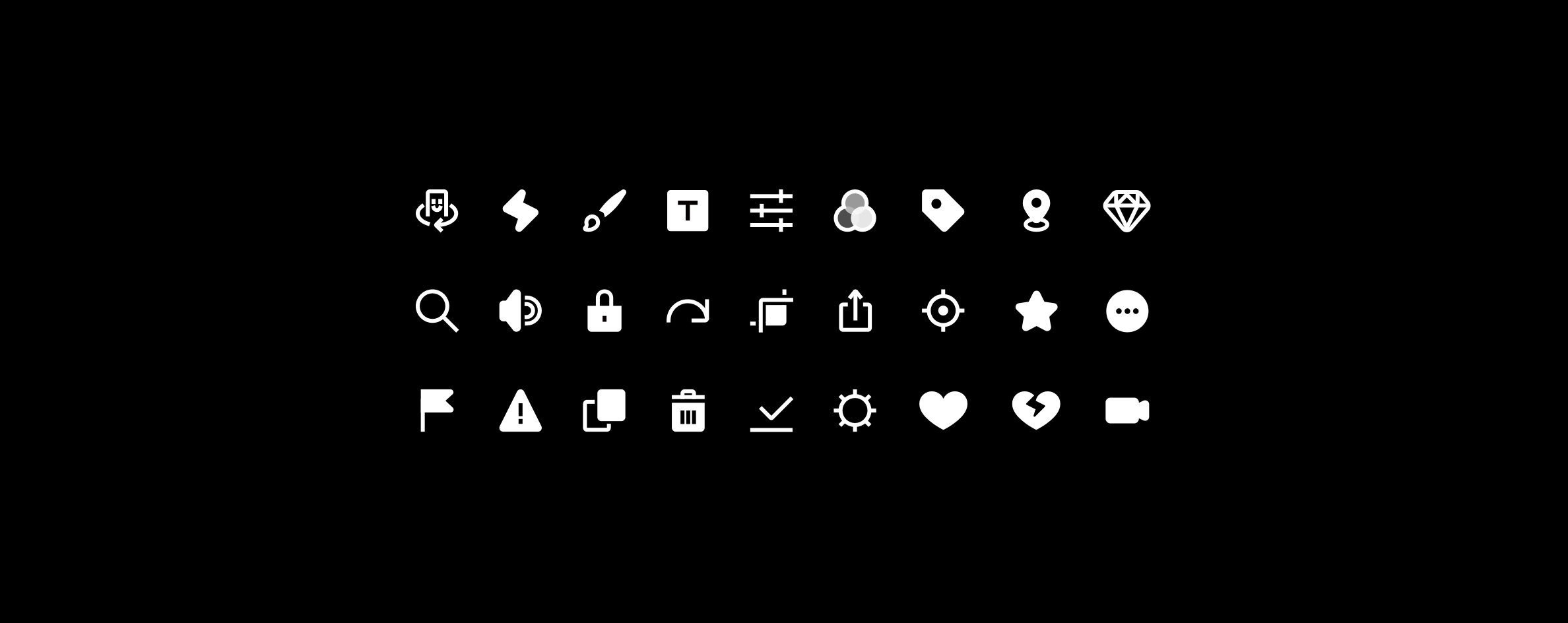
Following this style, I designed a collection of rounded icons and components to give the app a more friendly appearance.

New concept
We were inspired by the straightforward design of the Instagram app, the bold and professional look of VSCO, and the exciting hunt for the Snapchat interface's hidden tricks. With those concepts in mind, we created a more complete but minimalist experience using common gestures to keep the flow entertaining and efficient. Our main goal was to make sure the navigation was intuitive and the features easily accessible.
We conducted a preliminary set of user interviews and post-activity surveys with a sample group to test our design assumptions. We released the first version of the app on both iOS and Android platforms at the end of June.
A few weeks later, the McGill University of Montreal contacted us to sponsor the Arts Frosh event in August 2016. It was an excellent opportunity for our team to gather more feedback from a younger audience and evolve our product.

Onboarding
We wanted the users to familiarize themselves with our various functions and gestures without forcing an intrusive walkthrough.
Instead, we added in-app guidance messages at every big step of the process. We also used the gradient as a loading screen to reinforce the brand presence.

Map
Privacy-conscious users needed to enjoy features such as image capture and editing without forcing them to share their location. They could manage privacy controls through the map settings, giving them authority over the risks associated with exposing their location.
Like in an open-world game, we wanted to encourage them to explore the world to find newly posted moments. The minimum radius was up to 0.2 miles. The unexplored areas were automatically blurred to pique their curiosity. The more places they discovered, the more visibility they had on the map. A visited gallery would appear grey and turn back to active every time a new moment was posted.

Instants
Once a new area was discovered, they could switch between the most popular and most recent content in that area. Upon discovery, they could continue to get updates from a specific location by favoriting feeds. We also provided them with a reporting option to help us identify and monitor critical content.


We wanted the camera features to be as simple as possible. Instead of enclosing the users in action zones, we took advantage of the entire screen space.
We decided to use the most natural gestures: tap to take a picture, tap and hold to take a video (all limited to 60 seconds). It's as simple as that!


Customization
Instead of switching between a preset of filters, we needed this feature to be a fun and limitless experience where the users could slide anywhere on the screen to play with more blending options.


They could also draw, add captions, crop, and select the nearest feed they wanted their moments to be posted to for more customization.


Let's get ethical, ethical
We promoted Instant on social media, and our team was present at the Frosh event to give away t-shirts and stickers (and have fun).
We learned that more than 500 users downloaded Instant the first day of its launch - for a retention rate of 48% - and more than 6000 moments were posted all around the world. We received fantastic and inspiring feedback, and we were excited to discover the most liked moments every day.
・
We had proven that Instant could be an entertaining and interactive tool that could offer a dynamic look at the world in real-time. Despite the growing success of the product, we knew that without proper supervision, there were definite safety concerns around cyberbullying, sexual harassment, sensitive content posting, distracted walking, and location tracking.
We wanted the users to feel free to express themselves and explore the world around them while feeling safe and in control. Therefore, it was essential for us to monitor the content, deactivate push notifications, and provide them the option to report a post or disable their location tracking.
As the product gained traction, there was a growing undercurrent of complaints and hateful posts being reported. Anticipating that the problem would continue to grow, we ultimately decided to remove the app from the stores in December.
The outcome reinforced my belief that it is our responsibility as designers and engineers to anticipate a new product's negative impact on individuals. It is up to us to identify potential unhealthy behaviors and do our best to prevent them.
#designforgood